My First Wedding Design Package
- Jan 28, 2025
- 2 min read
This past December, I received a commission to design an entire wedding package, complete with invitations, signage, and specially custom-built displays. The clients are planning for a September wedding so, this gives me a realistic deadline to complete the deliverables for what should be a very comprehensive design solution.
After meeting with my clients, we were able to establish a creative brief in relatively short time. Beyond outlining the various items that the clients were requesting, we established a general design theme after an extensive conversation regarding the ideas they both had in mind.
Once I had established a timeline for the various deliverables, I presented the client with a creative brief for the project, including projected delivery times for items that would be created by more than one supplier.
However, before I could begin the ideation process for this formidable task, the clients asked if I would be good enough to also work with the bride’s mother, who was in the early stages of planning for her daughter’s bridal shower.

I was more than happy to accommodate their request and realized that this might be the place to establish the design theme that would be carried over into the wedding package. In this way, the wedding party would have their first sample of the design aesthetic, or brand, that would be applied to the entire event.

The first order of business was to develop bridesmaid invitation cards that the bride would use to inquire whether or not her chosen friends would be amenable to such an honour while also recognizing the responsibility and gravitas that is attached to such a role.
We had established early on in the creative brief that the design should evoke a sense of Renaissance nostalgia while keeping the content modern and informative. With that in mind, I started by testing various archival papers as backgrounds for the design, creating a rich backdrop that evoked a sense of old-world opulence.
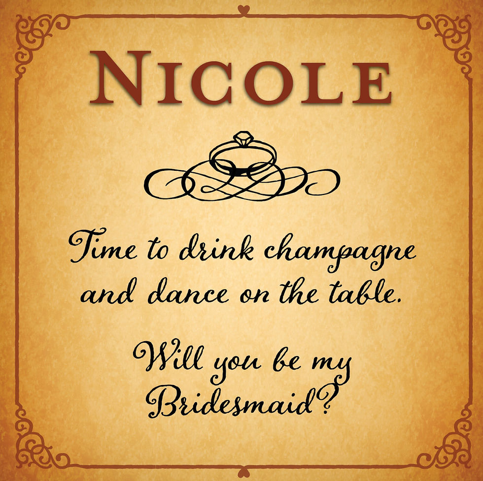
I then experimented with typography that would not look out of place in a Medieval setting but, still looked appropriate inn a modern context. I chose Mrs. Eaves Old Style as the title font — a beautifully designed typeface that is perfectly situated between multiple centuries yet, remains incredibly legible at almost any size.
For the text font, I chose Adorn Bouquet, a ruggedly handsome script typeface whose uneven edges are reminiscent of centuries-old hand drawn fonts. Despite the rugged design, the typeface remains surprisingly legible at even small text sizes and avoids the Baroque flourishes that render so many fonts difficult to read — thus, relegating them to the category of display fonts.

Ultimately, all the recipients accepted their invitations to participate in this bride’s special day. The message was right on target and had great appeal to each person, setting the tone, not only for the bridal shower but, for the entire wedding event.


Comments